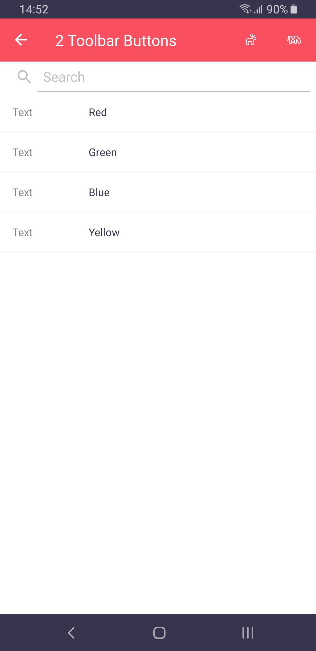
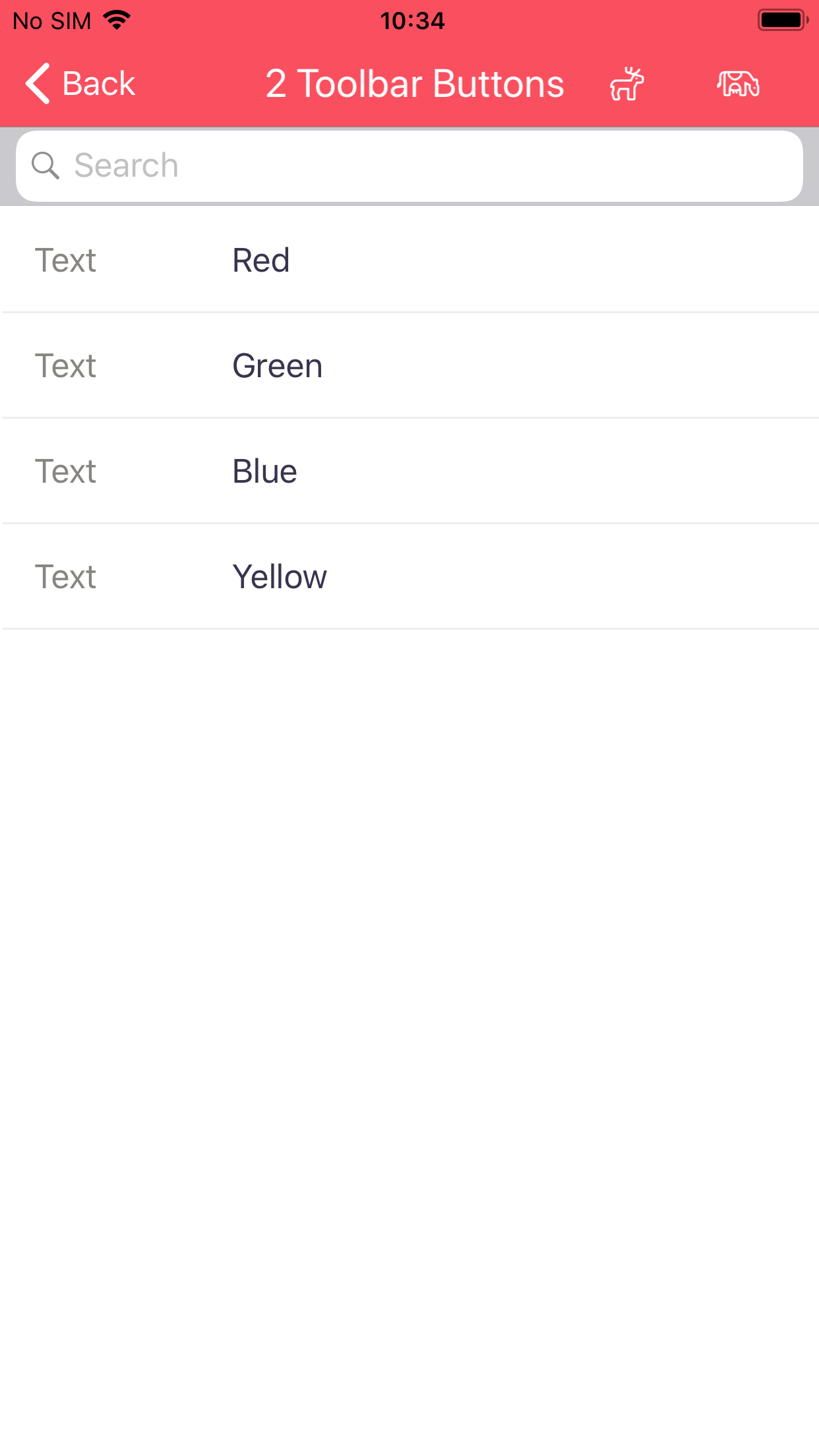
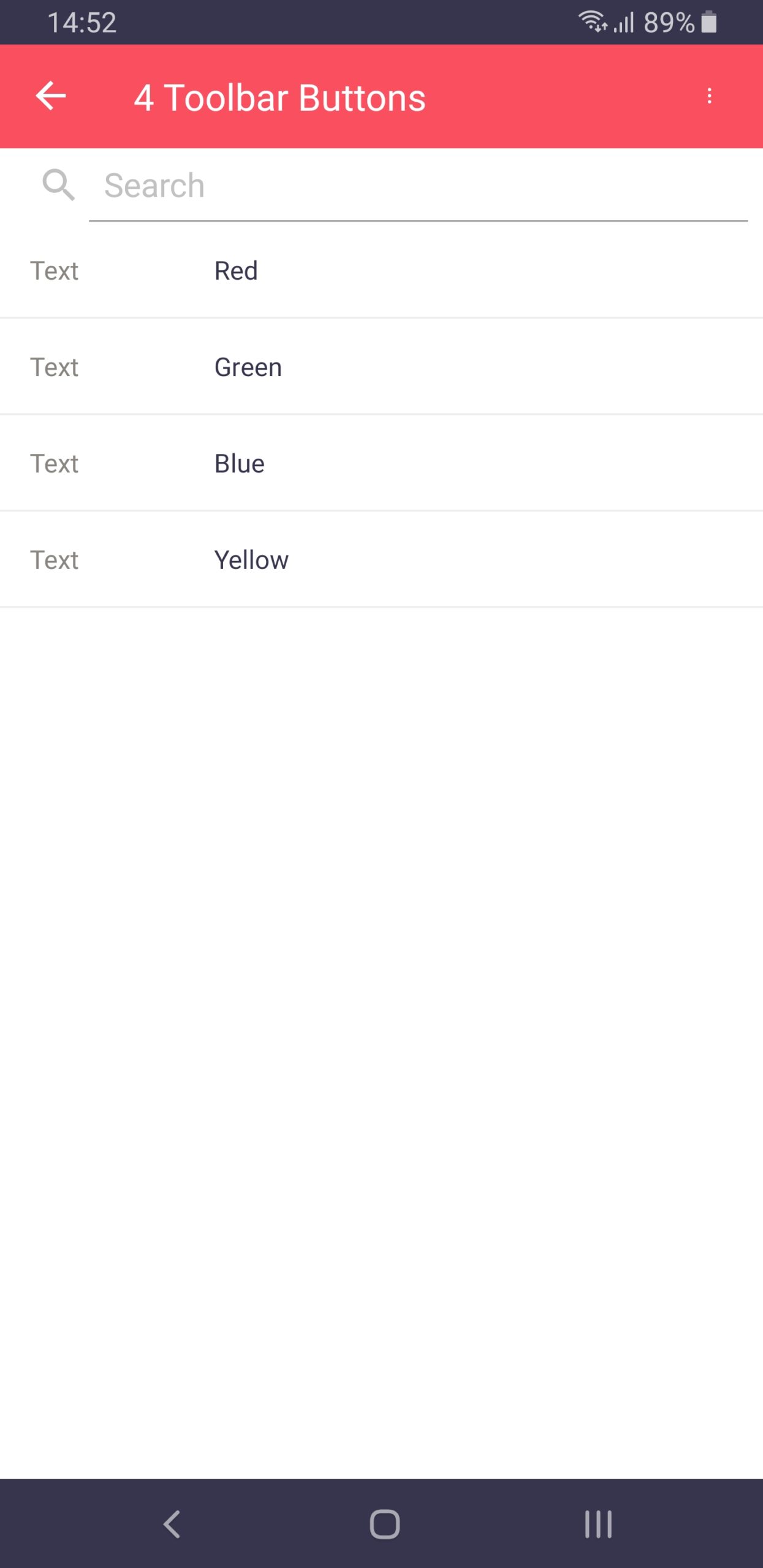
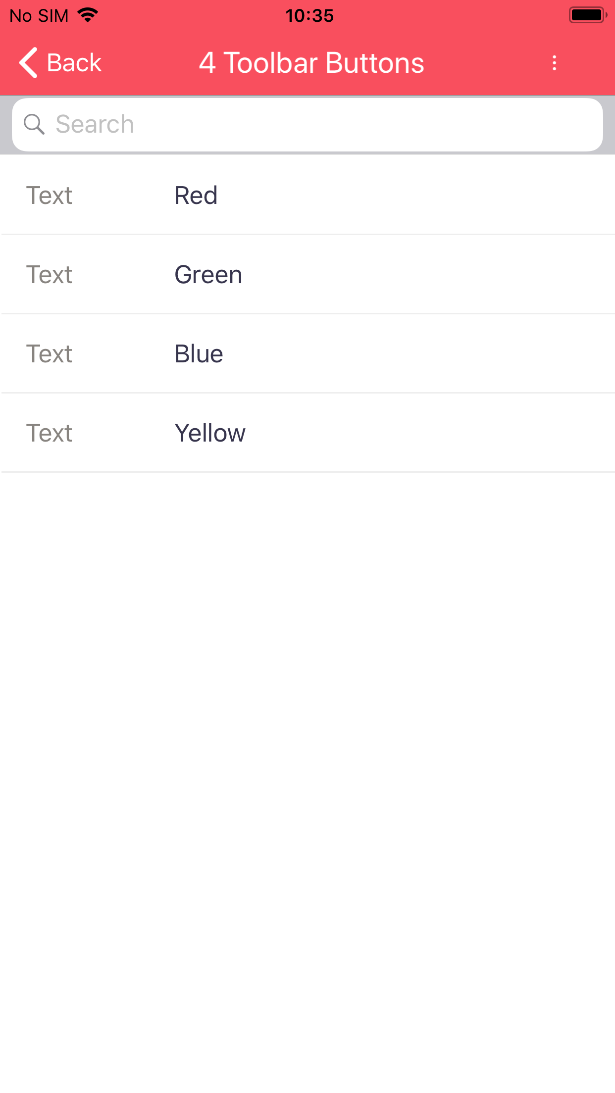
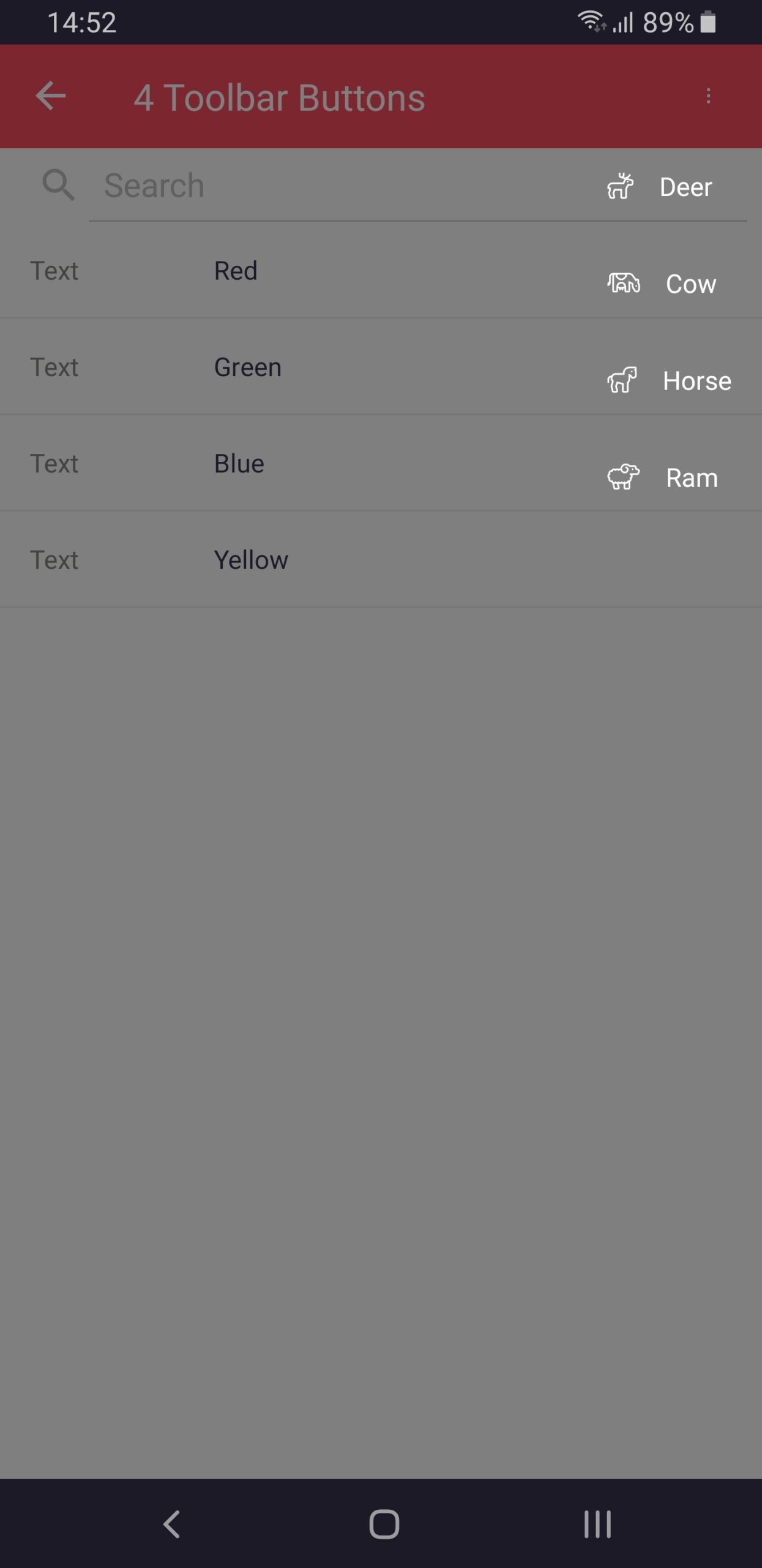
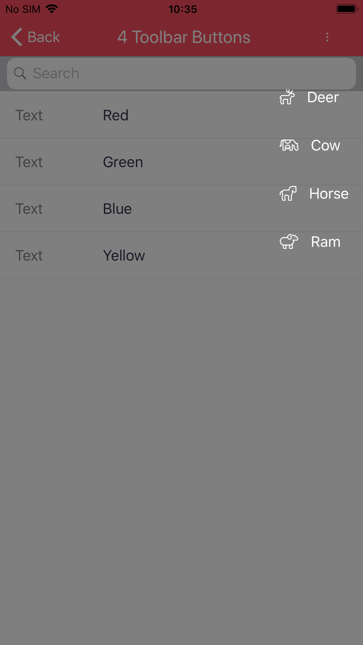
Toolbar Button
Note
Toolbar buttons only work when placed on List Views.
Properties
Details
Name
Text
Tooltip
Settings
Icon
General
Tab Index
Visible
Enabled
Format
Conditional Format
Events
Clicked
Actions
Focus
Special
Text
The text of a toolbar button is only shown when the K2 icon is set to “None” and no FontAwesome icon has been specified.
FontAwesome
In version 2.0 and above, you can use FontAwesome icons as the icon for a toolbar button.
In order to do so, you simply need to append the following to the name of the control: [fa|x|yyyy], where:
xneeds to be replaced by one of the following valuessfor the Solid icon set.rfor the Regular icon set.lfor the Light icon set.bfor the Brands icon set.
yyyyneeds to be replaced by the icon code. FontAwesome codes can be found in their cheat sheet.
A sample toolbar button name is toolBarButton1 [fa|l|f708].
Note
The FontAwesome icon takes precedence over the K2 icon.
Note
The default K2 icons are simple predefined icons FontAwesome icons.
Screenshots