Design a list view
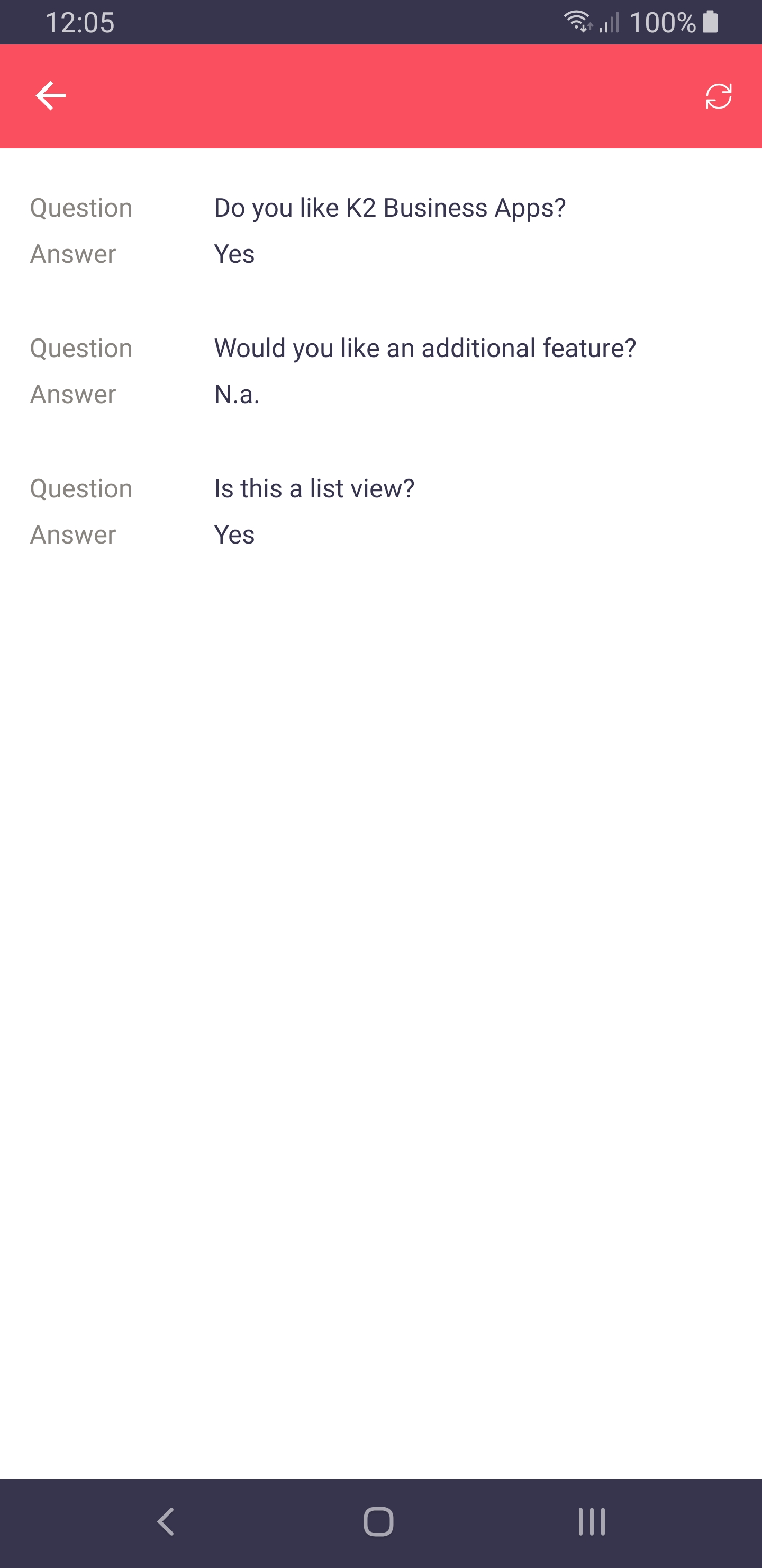
A List View in K2 allows you to show an overview of items retrieved by calling a SmartObject. This SmartObject is always linked to the view.
Layout
K2 Business Apps does not show views directly, so the list view must be placed on a form. Next to that, whenever a list view is found on a form, that will be the only view shown in the app. This is done as it would otherwise result in a view where you can scroll on a form where you can scroll, resulting in a non-user friendly interface.
As a device does not have the same available screen space as a monitor, rows will be shown as blocks, where each column is shown below each other. Image Attachments can be used to show thumbnails by changing the columns control to such a control. They cannot be clicked though, and will always show a square of the center of the image. Labels and data labels support styling, so if you want bold, italic, greenish text on a red background, go bananas!
Note
You need to style the control, not the column.

Rules
The most useful event to use is the “item click”, which is triggered when a block is tapped. Double clicking is not really a thing in such views and we’ve therefore not supported it. The list refresh is supported, provided the normal list method is called before the refresh.
Paging
The list view won’t render all items in one go, but takes a subset of the items and shows those first. Once the last item comes into view, the next batch is rendered. The amount of items rendered at once is defaulted to 10, but this number will be overwritten by the paging number you can set on a list view.
While it is not true paging, the rendering of items is sped up. All rows will still be retrieved from the server, so using list views that show thousands of items - especially those with images in them - is ill advised.
Editable List Views
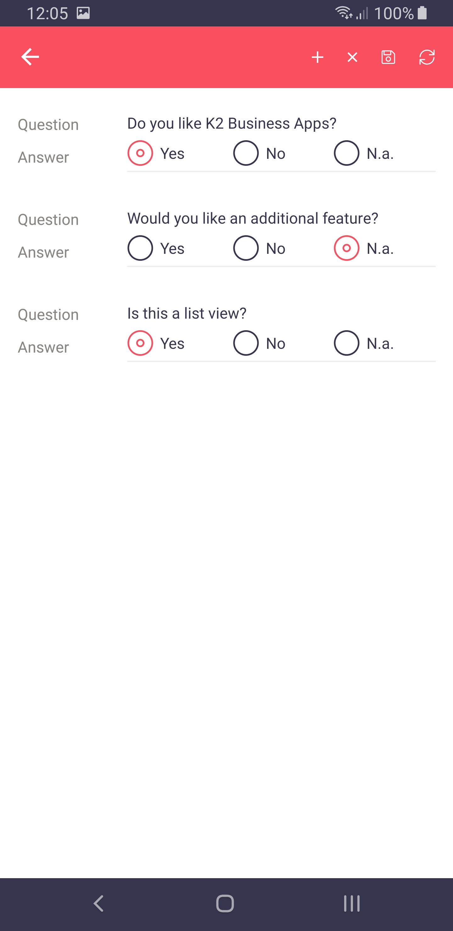
Since version 2.0, K2 Business Apps supports editable list views. They work slightly different than you may be accustomed to in a browser.

An editable list view will not show the controls you can see in the display row, but those shown in the edit row. This means that every row can be edited at all times, without the need to select it first. This allows users to immediately type text after clicking a text box, or pick a value from drop-down list, or select the correct radio button, without having to tap the row you want to alter first.
The out of the box events that are automatically generated when you tell the designer rows may be added or removed are supported. Some examples are:
When Add Toolbar Button is Clicked
    then add a new row to the editable list
When the View executed List item added
    then apply the changes made to the row on the editable list
When Save Toolbar Button is Clicked
    then complete the following in a batch
        also execute the Create for all the items that have been Added
        also execute the Save for all the items that have been Changed
        also execute the Delete for all the items that have been Removed
The event for double clicking an item is automatically added by the K2 designer, but don’t worry: the app simply ignores it. Leave it there so users that work with the browser can still double click a row.
Custom Layout
As of version 2.1 of K2 Business Apps, we support a custom layout for the list view.
Using the K2 Business Apps control’s method Set List View Layout you can tell the app how the current list view should look like on a phone or tablet, and in portrait mode or landscape mode.
Each of these four options needs three inputs:
The column definitions
The row definitions
The layout definition
The layout created can be viewed as a table: it holds columns and rows and each element can be placed in a cell and can be told to span multiple columns and/or rows.
Column and Row Definition
These two inputs define the table available to you layout definition. Both are a semi-colon separated list of items, where each item tells something about the column or row. These items can be one of three option shown below. They can be used in any order, as long as each column or row uses only one of them.
Absolute values
Star values
Automatic value
Absolute Values
An absolute value will specify exactly how wide a column is or how high a row is.
Star Values
These values are used as relative sizes and always end with an asterisk. Before the asterisk, a (non zero) natural number can be placed to alter the size of the column or row.
Automatic Value
By using the word “auto” to specify the width of a column or height of a row, K2 Business Apps will try to determine the height automatically based on the contents of the cells.
Examples
A basic three by three table where each column and row takes one third of the available space.
+---+---+---+
| 1 | 2 | 3 |
+---+---+---+
| 4 | 5 | 6 |
+---+---+---+
| 7 | 8 | 9 |
+---+---+---+
This is defined as:
Columns:
*;*;*Rows:
auto;auto;auto
Another example has three columns and three rows. The last column is twice the width of the other columns.
+---+---+-------+
| 1 | 2 |   3   |
+---+---+-------+
| 4 | 5 |   6   |
+---+---+-------+
| 7 | 8 |   9   |
+---+---+-------+
This is defined as:
Columns:
*;*;2*Rows:
auto;auto;auto
Layout Definitions
Once the table has been defined, you can specify what element from a list view should be placed where in that table. This notation is also a semi-colon separated list of items, where each item tells the app what element comes where. You can place multiple items in a cell. They will be placed underneath each other, in the order they appear in your layout definition
An item consist of three parts and the form xy(z), where:
xis one of two values:cfor a column namevfor the value of a row
yis the zero based column index of the list view as you see it in the K2 designer.zis the location in the grid. This comes in two flavors:(x, y)if you want to specify the exact cell(x, y, w, h)if you want to specify a starting cell and provide a column and row span, i.e. width and height.
Example 1
Given the following list view in K2:
+-------+--------------------+
| Name  |    Description     |
+-------+--------------------+
| Alice | A sample employee. |
+-------+--------------------+
| Bob   | Another employee.  |
+-------+--------------------+
And a desired layout in the app:
+-------+--------------------+
| Name  | Description        |
| Alice | A sample employee. |
+-------+--------------------+
| Name  | Description        |
| Bob   | Another employee.  |
+-------+--------------------+
We end up using the following:
Column definitions:
*;*. There are two columns.Row definitions:
auto. There is one row per row in the K2 list view.Layout definition:
c0(0,0);v0(0,0);c1(0,1);v1(0,1). When we break this down we find 4 items:c0(0,0)- This will place the column name of the first column in cell (0,0), the left cell.v0(0,0)- This will place the value of the first column in cell (0,0), the left cell again. Since there already is something in there, it will be placed directly below it.c1(1,0)- This will place the column name of the second column in cell (0,1), the right cell.v1(1,0)- This will place the value of the second column in cell (0,1), the right cell again. Since there already is something in there, it will be placed directly below it.
Example 2
Given the following list view in K2:
+-------+---------+--------------------------+------------+----------+
| Image | Name    | Description              | Due Date   | Status   |
+-------+---------+--------------------------+------------+----------+
| img1  | IR00001 | Our first issue report.  | 01-01-2020 | Accepted |
+-------+---------+--------------------------+------------+----------+
| img2  | IR00002 | Our second issue report. | 02-01-2020 | Draft    |
+-------+---------+--------------------------+------------+----------+
And a desired layout in the app:
+------+------------+------------+
|      | Name       | Status     |
|      | IR00001    | Accepted   |
|      +------------+------------+
| img1 | Description             |
|      | Our first issue report. |
|      +-------------------------+
|      | Due Date                |
|      | 01-01-2020              |
+------+-------------------------+
We end up using the following:
Column definitions: auto;*;auto. We want three columns. The first one contains our image and the width should be determined automatically. The last column is actually only used for the status and it too may be determined automatically, thus aligning the status right.
Row definitions: auto;auto;auto. Each row in K2 should result in three rows in our table. As the asterisk is not really defined for rows, we use auto.
Layout definition:
v0(0,0,1,3);c1(1,0);v1(1,0);c2(1,1,2,1);v2(1,1,2,1);c3(1,2,2,1);v3(1,2,2,1);c4(2,0);v4(2,0). When we break this down we find 9 items:v0(0,0,1,3)- The image is placed in the left cell, which starts at (0,0), is one column wide and three high.c1(1,0)- The column name “name” is placed in cell (1,0).v1(1,0)- The value is placed below it in (1,0)c2(1,1,2,1)- The column name “description” is placed in cell (1,1), is two columns wide and one high.v2(1,1,2,1)- The value is placed below it in (1,1).c3(1,2,2,1)- The column name “due date” is placed in cell (1,2), is two columns wide and one high.v3(1,2,2,1)- The value is placed below it in (1,2).c4(2,0)- The columns name “status” is placed in cell (2,0).v4(2,0)- The value is placed below it in (2,0).