Leaflet
This custom control allows you to show a map using a tile provider. On this map, you can zoom in and out, place, drag and filter markers and much more.
The control can be used in two ways within K2 Business Apps:
When placed on a view normally, it will be shown as a button that, when clicked, opens a full screen version of the control showing the map.
When the name of the control is appended with
fullscreen(including the space in front of it), the normal form is replaced by just the full screen version of this map.
Properties
Details
Name, the name of the control.
General
Visible, whether the control is enabled in a browser.
Enabled, whether the control is shown in a browser.
Map Settings
Width, the width of the control in a browser.
Height, the height of the control in a browser.
Map, the URL to a directory where the tiles can be found. The URL must end in the following format:
.../{z}/{x}/{y}.<image extension>default:/Runtime/Indocs/Custom Controls/leaflet/Maps/{z}/{x}/{y}.pngStart Zoom, the zoom level (0 or higher) where to start after the tile map is loaded.
Max Zoom, the zoom level (0 or higher) where zooming in further is not possible anymore.
Tile Width, the width (in pixels) of the tiles being loaded.
Tile Height, the height (in pixels) of the tiles being loaded.
Plugin - Fullscreen
Allow Fullscreen, whether the control will have a button to go fullscreen in a browser.
Plugin - Clustering
Show Coverage, whether the control will show the coverage of all markers in a cluster when hovering over it in a browser. The property Disable At Zoom must be 1 or more for this property to be applied.
Spiderfy On Max Zoom, whether the control will show the spiderfied markers in a cluster when disable at zoom is reached. The property Disable At Zoom must be 1 or more for this property to be applied.
Disable At Zoom, the zoom level where markers will no longer be clustered, default:
0
Plugin - Filtering
Tags, a semicolon seperated list that will appear in the filter list that can be used to filter markers. When no tags are specified, no filter controls will be rendered.
Button location, the location where the filter buttons will be rendered in a browser.
top right(default)top leftbottom rightbottom left
Markers
Directory, the URL to a directory where the images for markers can be found. If a marker is created with an icon that cannot be found in the specified directory, a default image will be used.
Markers - Data Source
SmartObject, the smartobject that will used when the Load Markers method is executed.
Method, the method that will be executed when the Load Markers method is executed.
Value, not used.
Display, not used.
The control expects the specified smartobject to have the following return properties.
ID, the marker’s ID. This property must be of typeGUID.
Latitude, the marker’s latitute on the map. Make sure this property is of typeTextto avoid localization issues with.&,. The control can handle both, K2 cannot.
Longitude, the marker’s longitude on the map. Make sure this property is of typeTextto avoid localization issues with.&,. The control can handle both, K2 cannot.
PopupText, the text that will be shown in a small popup over the marker when it is clicked. This property is optional.
AllowDragging, wether the marker can be moved around on the map, default:falseThis property is optional.
Tags, a semicolon seperated list of tags that are attached to the marker. This property is optional.
Icon, the image (including extension) that will be used to as an icon for the marker. The image must be in the control’s specified marker directory, see Marker Directory. This property is optional.
IconSize, the size (in pixels) of the specified icon for the marker. This property is optional.
Events
Latitude, the latitude of the last marker interacted with.
Longitude, the longitude of the last marker interacted with.
Marker ID, the ID of the last marker interacted with.
Events
Done Adding A Marker
Done Dragging A Marker
Done Saving As Image
On Click
On Fly End, will fire after center the Center on marker method. see Center on marker.
On Marker Click
Methods
Center on marker
Marker ID, the marker to center on.Zoom level, Optional parameter, default:current zoomlevel
Center on location
Latitude, the latitude to center on.Longitude, the longitude to center on.Zoom level, Optional parameter, default:current zoomlevel
Change marker icon - Note: this will only update the marker on the map, the datasource will NOT be updated automatically!
Marker ID, the marker to update.Icon, the image (including extension) that will be used to as an icon for the marker. The image file must be in the control’s specified marker directory, see Marker Directory. This property is optional.Icon Size, the size (in pixels) of the specified icon for the marker. Optional parameter
Change marker tags - Note: this will only update the marker on the map, the datasource will NOT be updated automatically!
Marker ID, the marker to center on.Tags, a semicolon seperated list of tags that are attached to the marker. If no value is provided, all tags will be removed from the specified marker. This property is optional.
Clear markers - Note: this will only update the markers on the map, the datasource will NOT be updated automatically!
Create a marker - Note: this will only create a marker on the map, the datasource will NOT be updated automatically!
Marker ID, the marker to center on. This property is optional.Latitude, the latitude to create the new marker on.Longitude, the longitude to create the new marker on.Popup Content, the text that will be shown in a small popup over the new marker when it is clicked. This property is optional.Allow Dragging, wether the new marker can be moved around on the map, default:falseThis property is optional.Tags, a semicolon seperated list of tags that are attached to the marker. If no value is provided, all tags will be removed from the specified marker. This property is optional.Icon, the image (including extension) that will be used to as an icon for the marker. The image must be in the control’s specified marker directory, see Marker Directory. This property is optional.Icon size, the size (in pixels) of the specified icon for the marker. This property is optional.
Get filters
Hide markers
Except Marker ID's, the marker ID’s that will not be hidden as semicolon seperated list. This property is optional.
Load markers
Save as image
Filename, the filename of the new image. If no value is provided, the marker’s ID will be used. This property is optional.Marker ID, the marker to attach image to. The specified smartobject must have an input property namedMarkerIDSmartObject ID, the smartobject to execute on the K2 server.SmartObject Method, the method on the specified smartobject to execute.Target Property, the name of a property on the specified smartobject in which to store the image.
Set filters
Filters, a semicolon seperated list of tags. Only markers that match one of the specified tags will be shown on the map. If no value is provided, no filters will be set. This property is optional.
Show fullscreen
Show markers
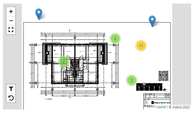
Screenshots